Role
UX Lead
Timeline
March - June 2026
Team
3 people
Skills
- UI and UX design
- Product design
- Prototyping
When Search Sensei's CEO came to our university capstone, he had a platform with real enterprise ambition and no UI to show for it.
Our three-person team took on the full design, a public-facing AI search experience, and a developer handoff document, from a blank canvas.
Context
What is Search Sensei: think smarter search, built for organisations
Search Sensei is a knowledge-discovery platform built for organisations that need to locate, understand, and reuse information at scale. It sits at the intersection of search, AI, and agentic capabilities, designed to surface the right answer confidently, not just a list of links.

Problem
Search has gotten smarter. The experience hasn't kept up.
AI can now answer questions directly, but most interfaces leave users with more questions than answers. Three friction points kept surfacing across existing products:
Trust and transparency
AI gives a direct answer, but its reliability is uncertain
Query formation
Not all users know how to phrase questions effectively
Information overload
Without smart filtering, results pages becomes filled with noise
Objectives
A clear brief, with real constraints
Search Sensei needed a production-ready search experience that any website could plug in, generic enough to work across industries, sophisticated enough to handle AI responses with confidence.
Our job was to design it end-to-end and hand it off to developers in a format they could build from directly
| In scope | Out of scope |
|---|---|
| Public-facing AI search experience | Admin UI |
| AI mode | Backend infrastructure |
These were the final deliverables
Starting Point
Search Sensei was already live. But it wasn't enough.
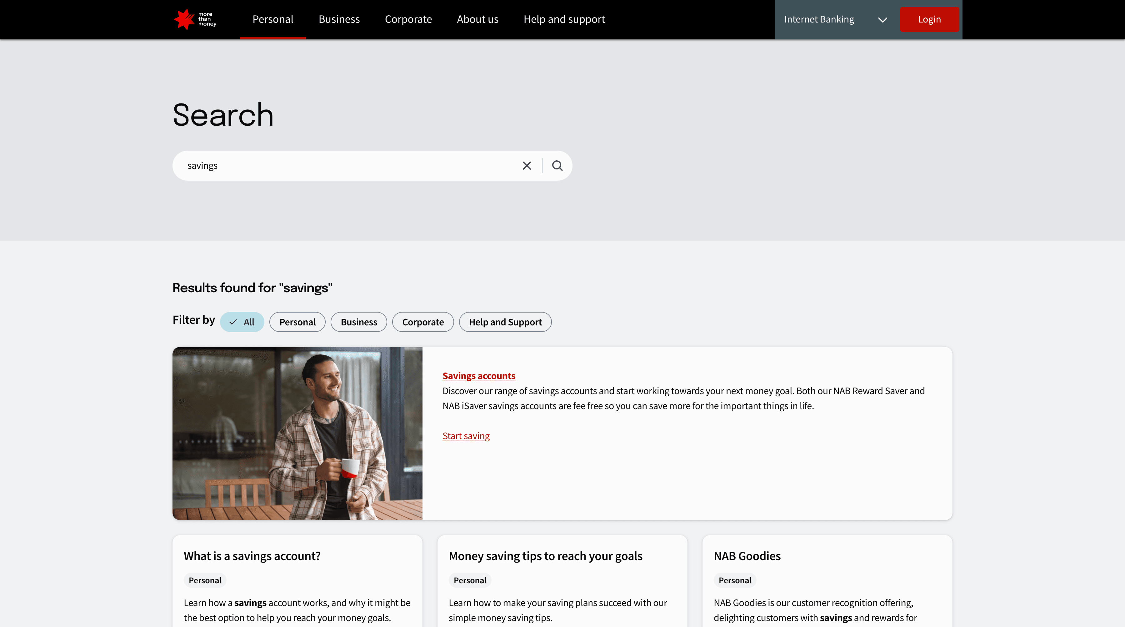
Search Sensei powered NAB's existing search, but it was purely traditional, no AI involved. That's exactly the gap we were designing to close.
Design Process
Research first, design second
We followed a Design Thinking approach, starting with understanding the space before touching any screens. Every decision from here was grounded in what we observed, not what we assumed.
Understanding the space: before designing anything, we studied what already existed
We started by analysing three products: Google, Bing, and NAB, because they represent different ends of the search spectrum: consumer-scale AI search and a real-world example of enterprise website search. For each, we mapped out every element and interaction in FigJam, screenshotted and annotated key UI patterns, then sorted them into what worked, what didn't, and what was worth adapting.

What we decided to carry into our design:
Building the wireframes
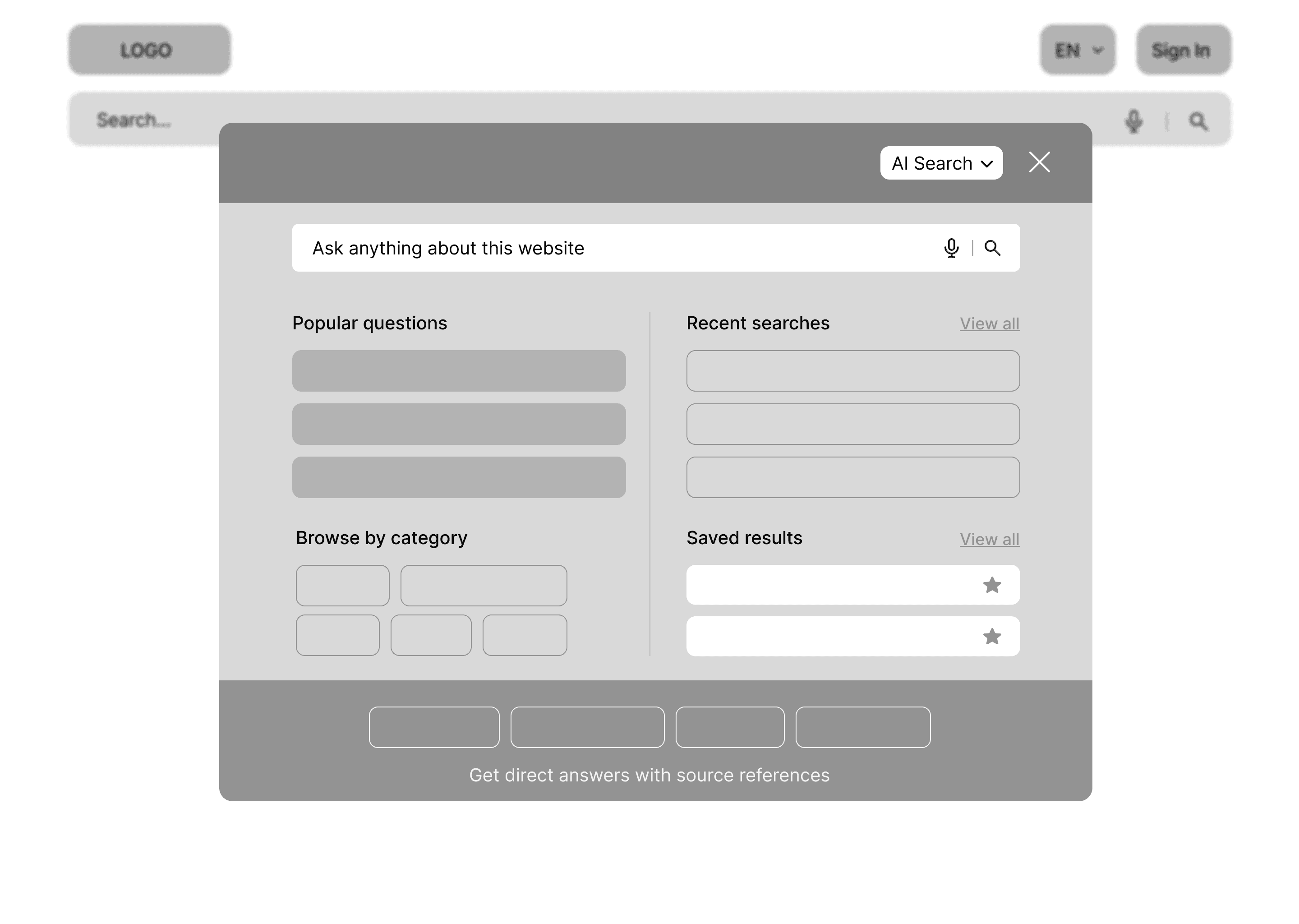
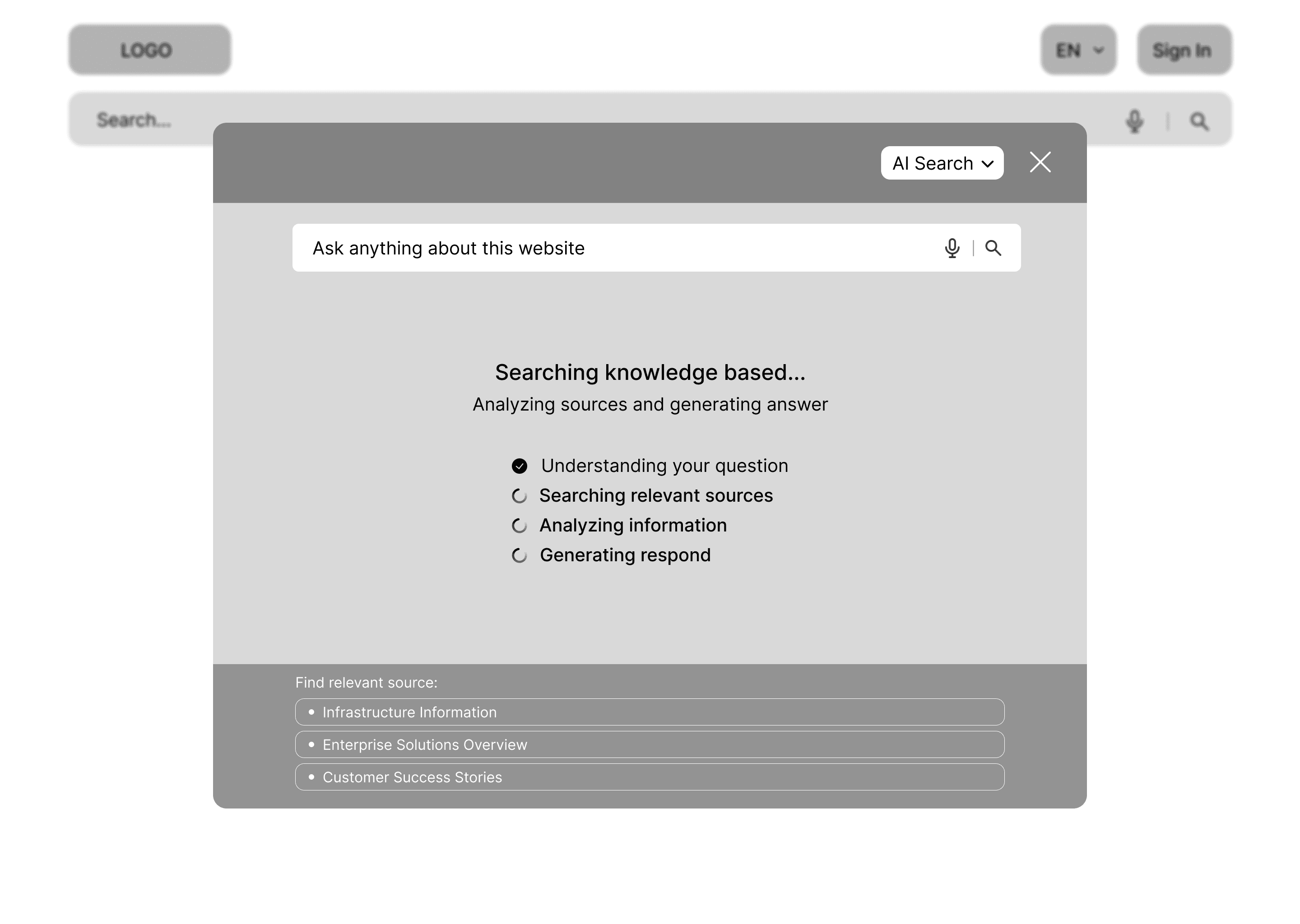
With our research locked in, we moved into wireframing: working out layout, hierarchy, and screen flow before touching any visuals. We covered the full search journey: the opening state, predictive suggestions, the loading state, search results with AI and traditional views, and the sources and citations detail screen.
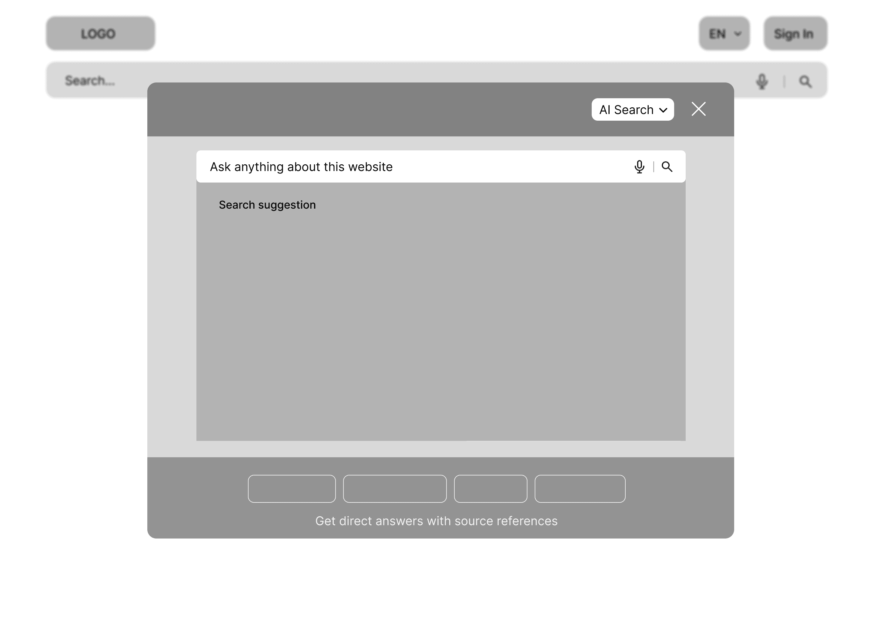

Our first attempt at the design
We moved into mid-fidelity to start making real design decisions, translating wireframe structure into something you could actually react to, with real content replacing placeholders to get a true feel for the experience
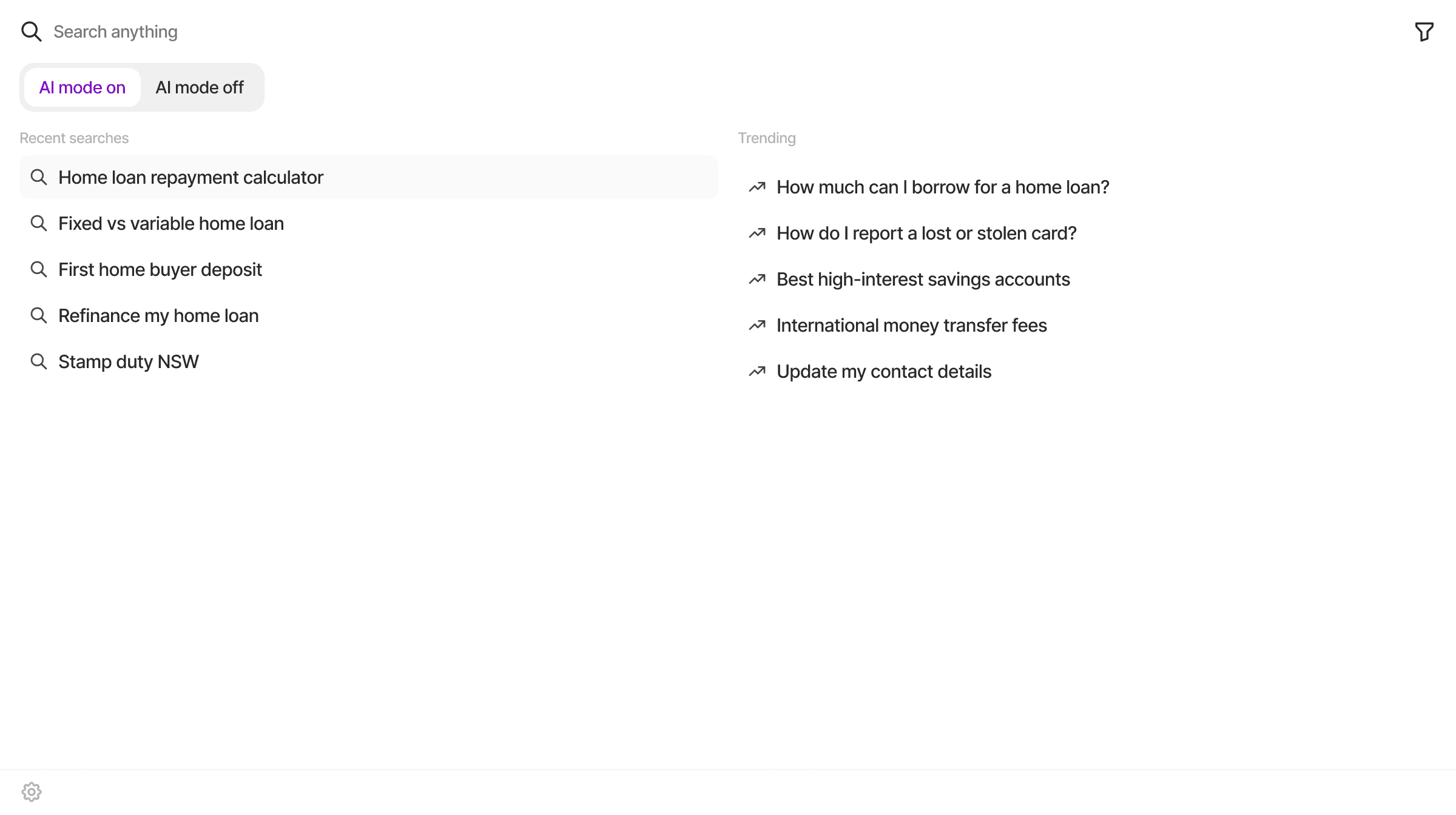
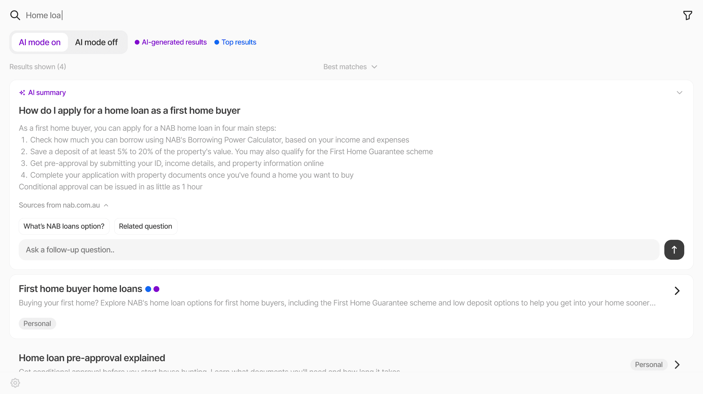
Good feedback doesn't just point at problems.. it points at better decisions.
After sharing our initial concept with our client and lecturer, four things came back consistently:
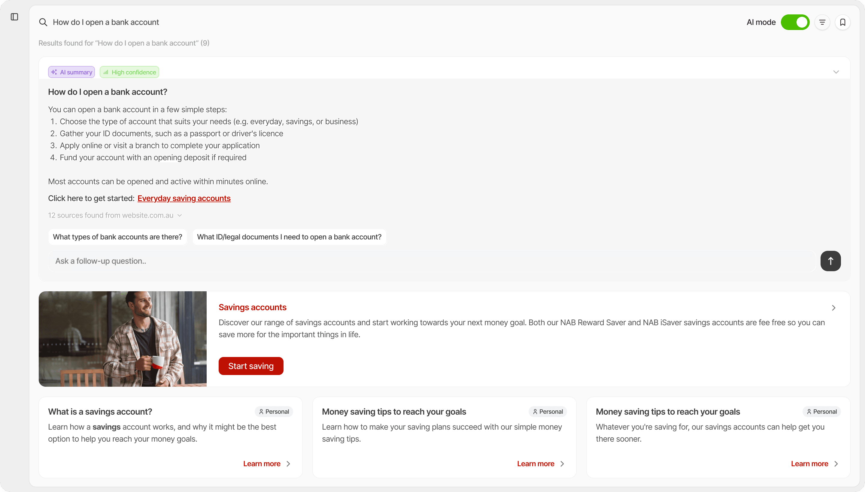
- The AI mode toggle wasn't distinct enough, users couldn't tell it was doing anything different
- Results felt overwhelming, too much text and information competing for attention
- No clear visual hierarchy between AI-generated and traditional results
- Needed NAB branding applied to ground the prototype in a real context
Final Design
Search, reimagined
Here's how the final experience comes together, screen by screen.
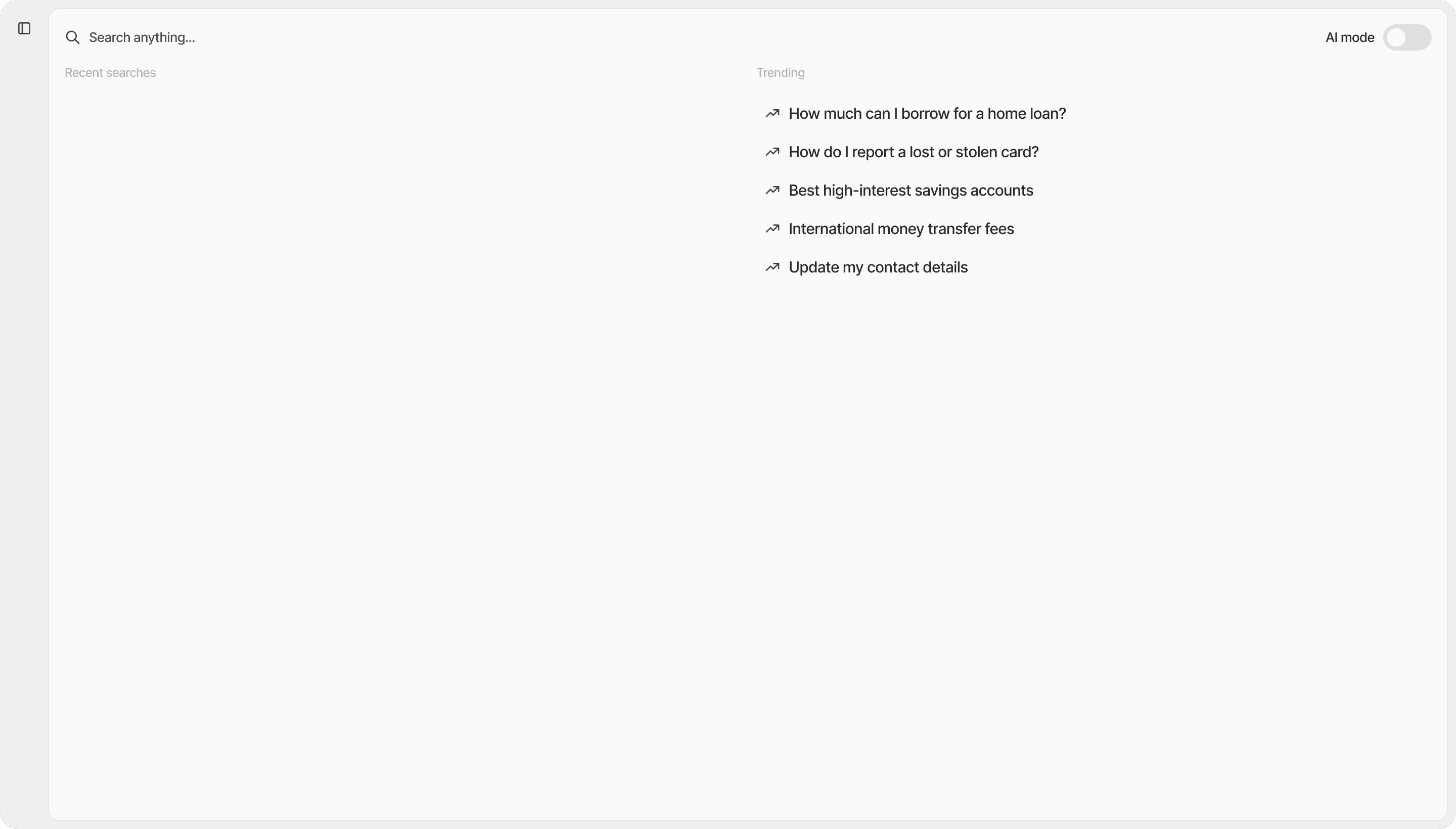
The default state
The first thing users see when they open search. Trending searches for those who aren't sure what to ask, recent searches and favourites in the sidebar for those who are.
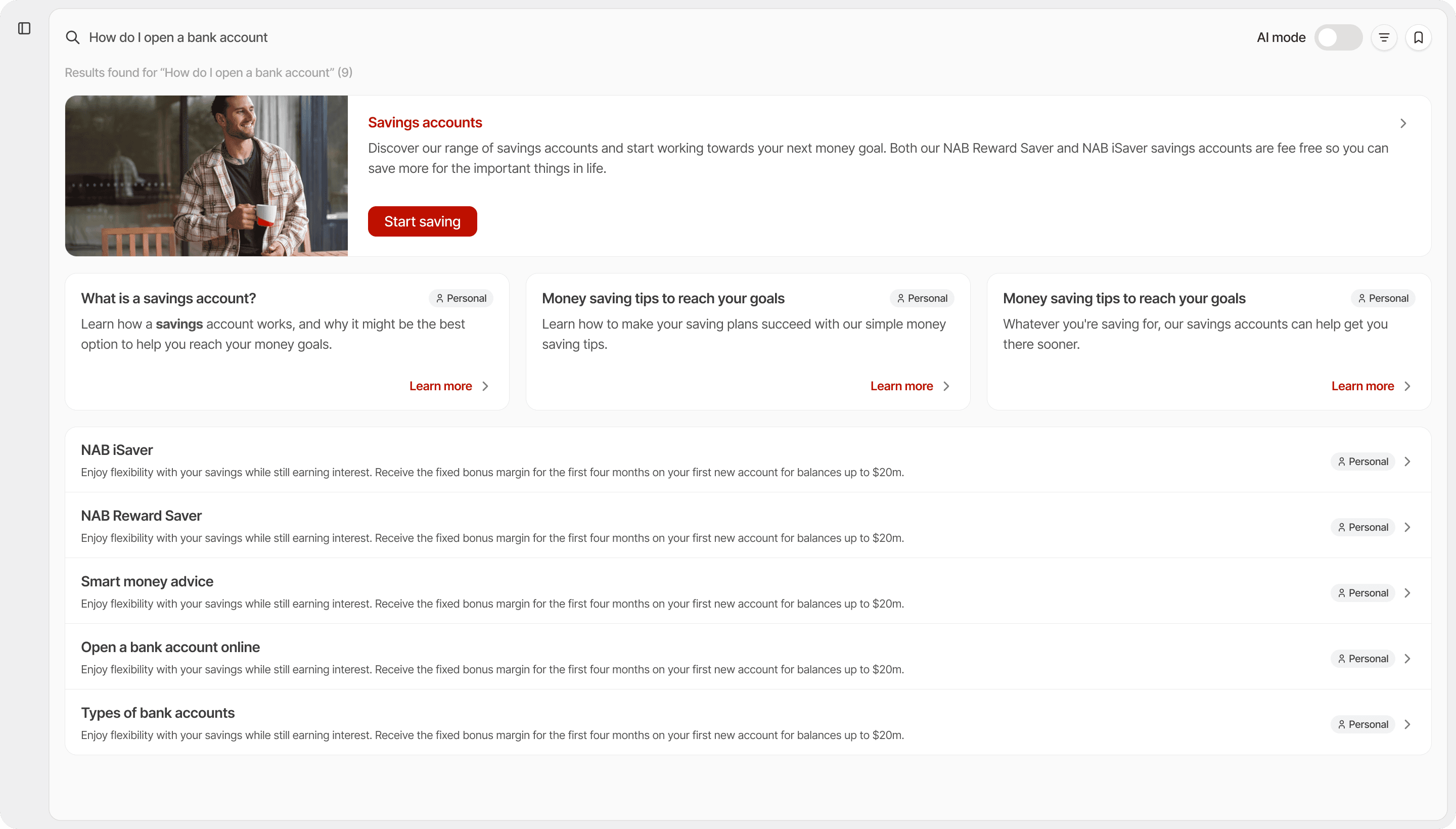
Search results
Results are organised by relevance, not recency. The most useful answer surfaces first, followed by a primary card and supporting results below. Every result is tagged by category so users can orient themselves at a glance.
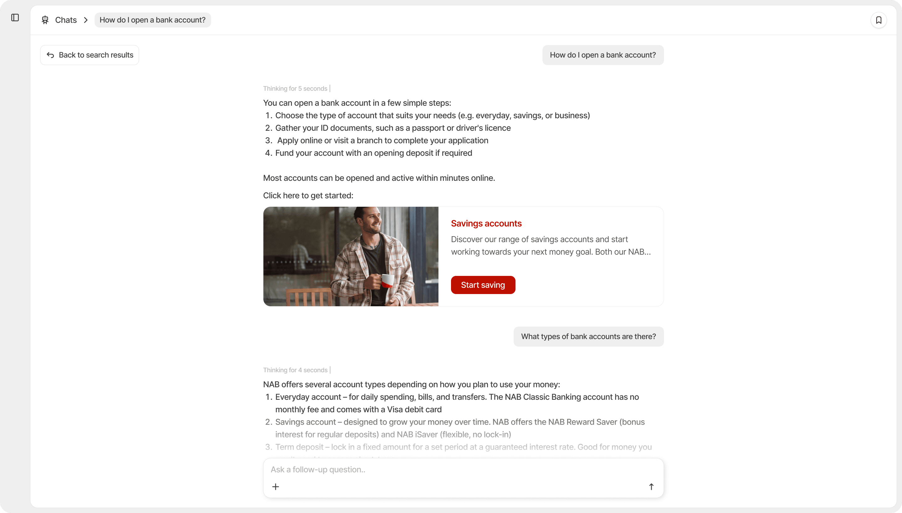
AI Chatbot
When a search result isn't enough, users can keep going. The chatbot lets users ask follow-up questions and dig deeper, without losing the context of where they started. A “Back to search results” link keeps them oriented the whole time.
AI vs Traditional Mode
User choose how they want to search.
The same search query, two completely different experiences. Here's what changes when you choose between:
Clean, familiar results. A primary card surfaces the most relevant content at the top, followed by supporting cards and a list of additional results below. No AI involved, just the most relevant content, clearly organised.
Information Hierarchy
Designed for relevance, not recency.
Results are ranked by relevance and rendered into four distinct levels, each designed to match how much detail that result deserves.
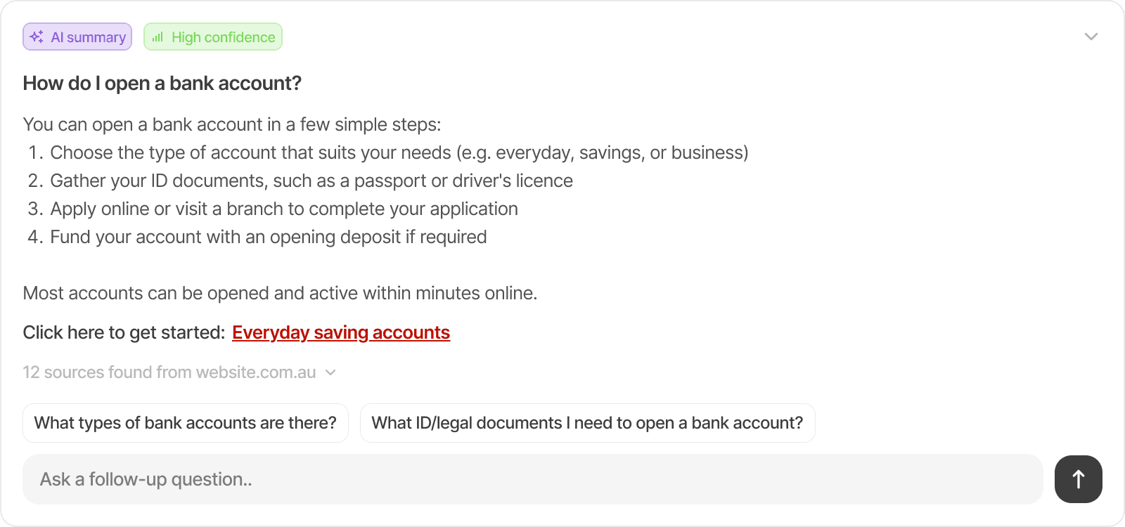
AI summary card
Only appears when AI mode is on. Generates a synthesised response with a confidence tag, sources, and suggested follow-up questions.

Primary card
The highest-relevance result. Full-width with an image, title, and a CTA button. Always the first thing users see when AI mode is off.
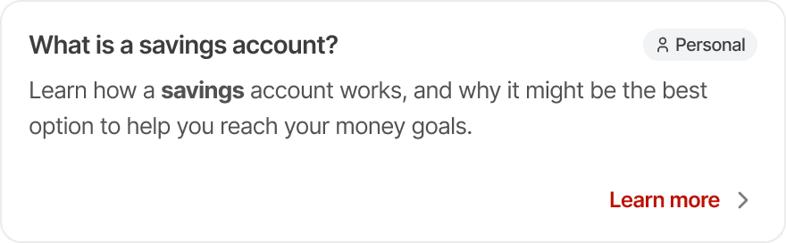
Normal card
The next tier, displayed as a three-column card row with title, description, and category tag.
Lists
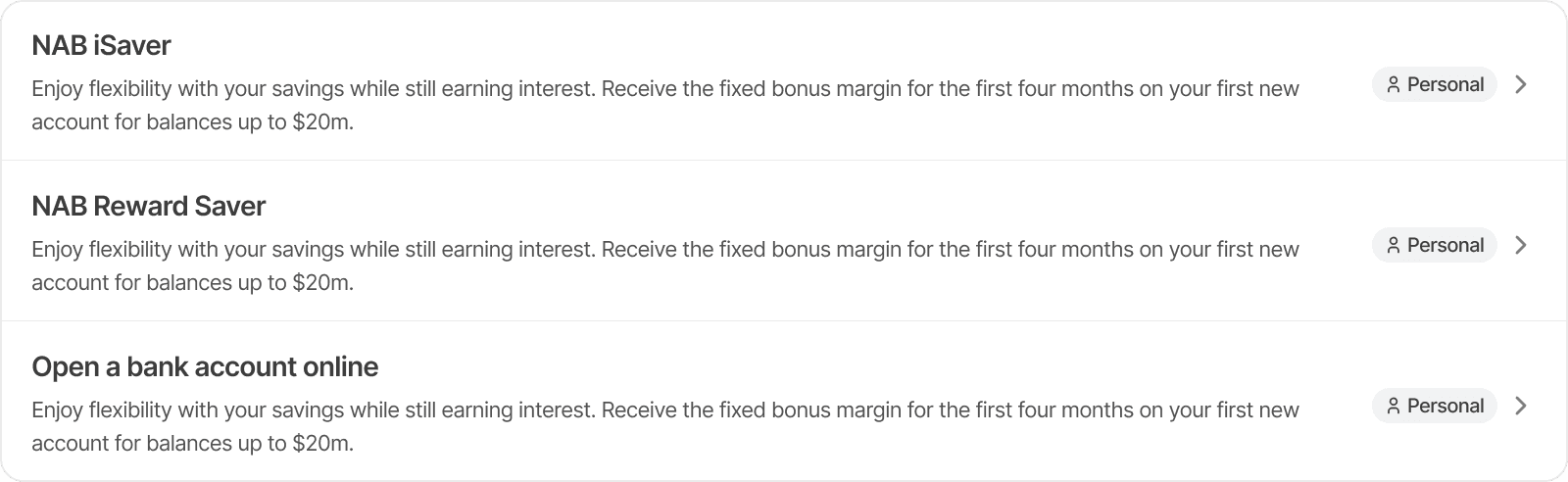
Remaining results as compact rows for quick scanning.
Learnings
What this project taught me
Three things I'd carry into every project from here:
Clarity comes from conversation, not the brief
Starting from a brief alone wasn't enough. Real clarity only came after several meetings with the client
Familiar patterns exist for a reason
What we designed isn't radically different from existing search, the fundamentals are the same, just executed more intentionally
Know your tool's limits before you hit them
Figma couldn't execute every interaction I had in mind. Moving to code helped, but came with its own learning curve.